Our Blog
Latest news and updates from flathost
DIY UI – Web and Mobile App Wireframes and Designs
Posted by Alex Giavis on 05 08 2017. 0 Comments

Many years ago, long before dedicating my career to graphic design, I introduced myself to the industry as a freelancer, assisting friends and folks in my network for branding and website building. As an amateur learning the ropes, I found wireframing unnecessary and didn’t explore the value they offered. Spending countless hours rendering ideas through sketches seemed like a poor use of my time and resources, since it didn’t directly minimize the time in creating web assets for the final product. The notion of creating dozens of dull, static digital representations that neither illustrated the interactions, or showed the dynamic aesthetic that would excite any young artist seemed uninspiring! I relied heavily on in-browser design by opening up my trusty notepad, and diving into coding the user’s interface.
It was simpler times; I was working for folks I had relationships with, and an established level of trust that is typically uncommon when any amount of money is being forked over. I was confident in delivering something looking and functioning up to snuff with my “friend-clients,” and this nepotism factor was an advantage I didn’t realize I had. It’s clear now that my approach was not only obsolete by today’s standards, but could further waste time by welcoming vulnerabilities for miscommunication and avoidable revisions. For the same reasons, when addressing portraiture, you would outline proportions of the face before articulating individual eyelashes and strands of hair. Similarly, the composition of a website first needs client approval in meeting expectations before leaping into a polished, coded product. As user experience design evolved, methods of web interaction expanded to mobile devices. Now the amount of consideration demands this system of planning out the final product to ensure its optimal functionality.

So What Is It?
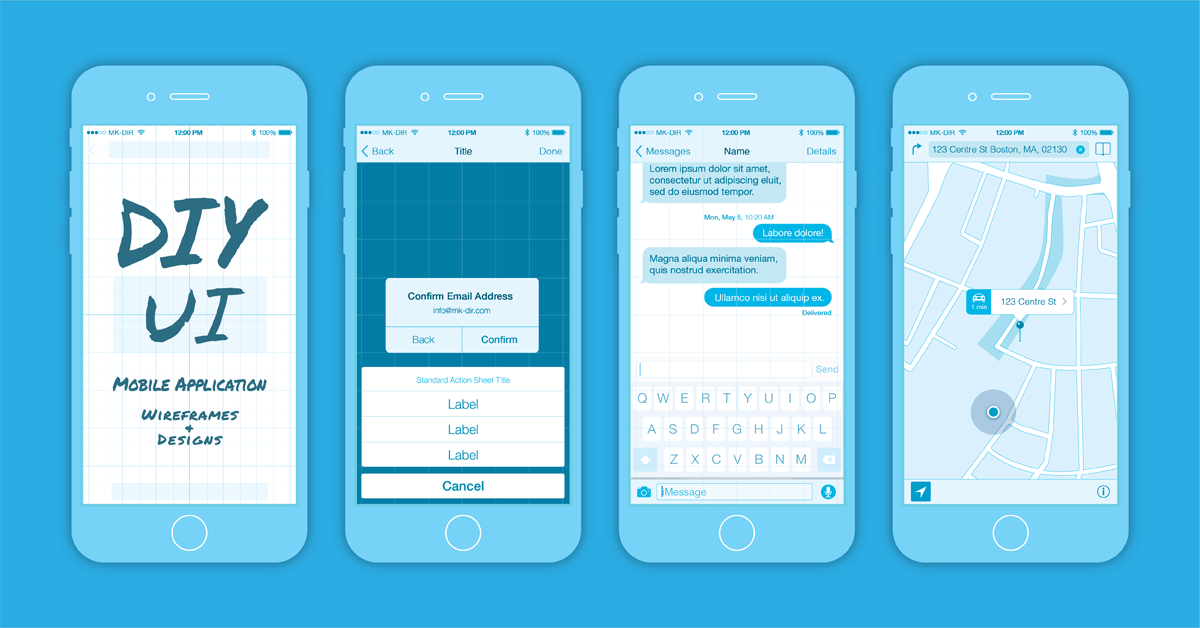
Wireframes aren’t finished products, and should never be treated as such. As designers, it is easy to fall victim to the perfectionist habits of overworking. The point of this step is to inform the end graphic decisions, but not to ultimately be them. For this reason, tools like Mocking Bird, Gliffy, and Mockflow are widely used to expedite this process. They are great substitutes, but it is never a bad idea to bust out your pen and pad! You can download our[ninja-popup ID=1603] custom mobile wireframe template here,[/ninja-popup] and try your hand at rendering proportionate UI designs.

By creating these skeletal “blueprints,” you can confirm placement, amount of content, and user navigation with your clients before delving into the labor intensive task of fully realizing the UI/UX design responsively. This paves the way for nailing the desired aesthetic and information architecture, while affording the freedom of edits with minimal time lost… because let’s face it, deadlines are hard enough to meet when you are relying on a client to hand over the copy/images anyway!
How do I get Started?
Each project has its own specific needs. That is to say, there is no one-size-fits-all and you could end up using one of many approaches to meet the demands of your situation. One might involve numerous page iterations to show the many functions and linked sub-domains, and others could be summed up in a simplified single-page layout. Multiple files of web page wireframes may suffice for some, while one large flowchart displaying interface’s navigation may be required for others. The only way to gauge what the right method will be is learned through understanding the client’s needs. After doing this, you can begin providing them with the appropriate materials to move forward.

It is important to note that while these visual representations are a great translations of a client’s vision to something that inspires excitement and faith in your ability, their purpose extends further to allow a website’s successful construction. Wireframes serve as directions for designers and front-end developers, guiding them to building the perfect product.
Nailing UI Design…
Clear, coherent, and to the point: I am not referring to the copywriting, but the delivery of the content. The saying that “content is king” was a loudly stated mantra of design that, as technologies developed, has undergone some reconsideration. If the methods of user interaction evolve, then so must the requirements and obligations of the designer. Content is only one player on the team, and it must work in unison with the rest of the roster to create a balanced, well-structured and user-oriented interface.
To design the optimal user experience now, simply relying on tried and true methods will leave you susceptible to falling victim to obsolete user experience. A contemporary designer will succeed by keeping ahead of recent trends, and generating designs that serve the changing needs of the users. This process of wireframing can serve as an essential tool in establishing a functional protocol that both makes efficient use of your time, and keeps your focus on the users while designing the perfect UI.
Resources
As always, please reach out if you have any questions about what was covered in this blog post, or if you are interested in learning more about creating wireframes. You could always schedule a call with us, or send an email to [email protected] for more information. Download the[ninja-popup ID=1603] mobile wireframe template here [/ninja-popup]to begin creating your own user interface!
